Understanding Bizzkit CMS
This article serves as a thorough introduction to Bizzkit CMS and aims to provide a detailed understanding of the CMS's concepts, features, and capabilities. Bizzkit CMS, developed on the Builder.io platform, offers a comprehensive collection of tools for managing e-commerce content.
In this article, we will cover the key aspects of Bizzkit CMS, including its integration with various plugins and components. The focus will be on practical knowledge and skills, enabling users to fully leverage the CMS in their e-commerce projects.
Visual Headless CMS
Before diving into the product, it's important to understand the term - visual headless CMS.
A visual headless CMS is a modern approach to content management that separates the back-end (where your content is stored and managed) from the front-end (how this content is displayed on your website or app). This 'headless' approach offers immense flexibility, allowing you to use your content across different digital platforms without being tied to a single display format.
The 'visual' part of a visual headless CMS comes from its user-friendly interface. Unlike traditional headless systems that often require technical skills to navigate, a visual headless CMS provides a more intuitive, graphical interface. This means you can design, organize, and preview your content in a way that's easy to understand and manage, even if you're not a developer.
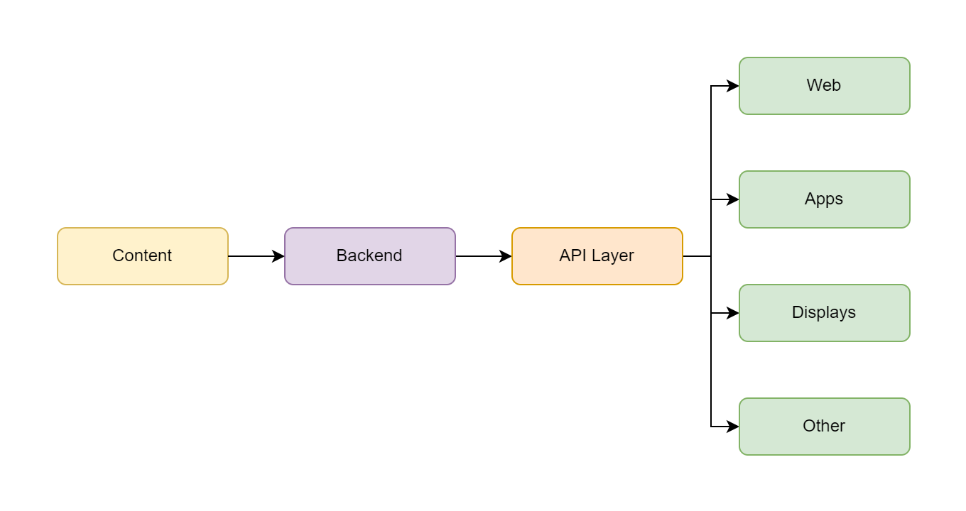
In essence, a visual headless CMS like Bizzkit CMS combines the best of both worlds. It gives you the flexibility to distribute your content across various platforms (websites, mobile apps, digital displays, etc.) while maintaining a user-friendly interface for creating and managing this content. This approach simplifies content management, making it accessible and efficient, particularly in the dynamic field of e-commerce.
A Simplified Technical Overview
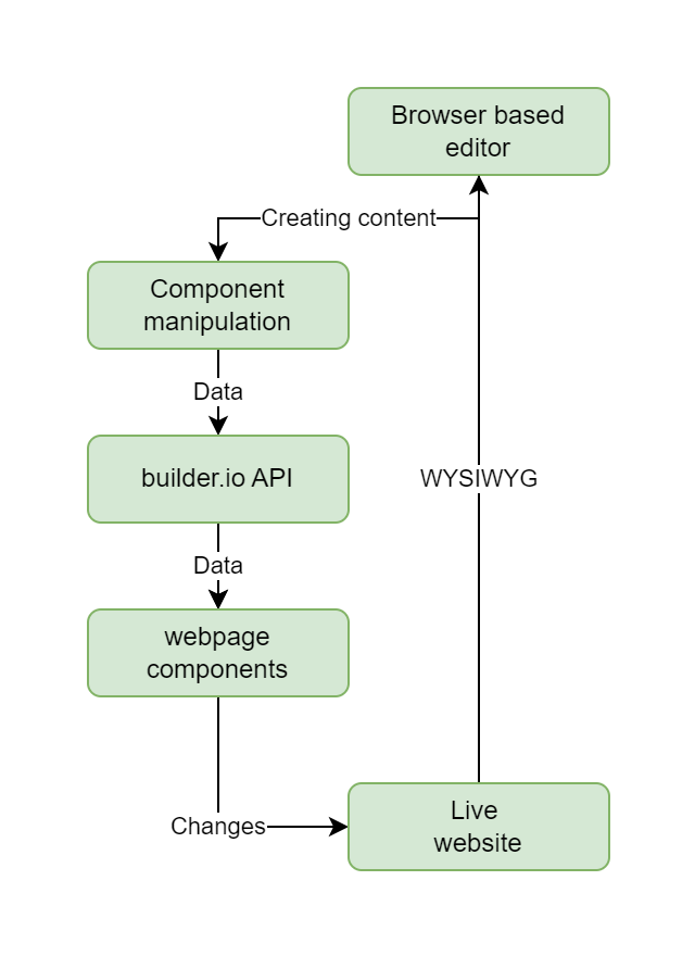
The core of the CMS is its web-based editor interface. This is where users interact with the CMS to create or alter content, similar to using a sophisticated text editor, but within a web browser. A critical feature of this CMS is its component-driven design. A webpage is composed of various components like text sections, images, or interactive elements, each functioning independently while fitting into the overall page layout.
A vital element in this setup is the integration with Builder.io, which acts as a conduit between the CMS editor and the live website. Editing a page in the CMS involves manipulating JSON data, a format used for easy data interchange. Each component on the webpage corresponds to specific JSON data in Builder.io.
Updating the website is streamlined. When changes are made and published in the CMS editor, these updates are pushed to Builder.io, which then updates the JSON data relied upon by the website components. This system ensures a true "What You See Is What You Get" (WYSIWYG) experience. The modifications made in the CMS editor are precisely reflected on the live website, offering a seamless content update process.
Overall, this CMS is designed to be intuitive for non-developers, offering a user-friendly editor and a component-based website structure, all integrated smoothly with Builder.io for timely content updates. It strikes a balance between user-friendliness and technical sophistication.
Developer's Perspective
The e-commerce web solution (based on Bizzkit Blueprint) is structured as a Single Page Application (SPA) and is developed using React. A key aspect of this setup is that the components used within the CMS editor are not just generic placeholders. Instead, they are actual React components that have been registered and defined in the application's source code. This means that when these components are manipulated or edited in the CMS, the changes are directly reflected in the React components of the editor and the live application.
To setup a SPA to work with builder you need a public API key - see the Builder Quick Start for more information.
Organize users and content
To get started, as a content creator, you'll need your Builder login details. Once you're in, you're part of an organization as a user with specific permissions like Contributor, Editor, Designer, Developer, Admin.
| Access | Contributor | Editor | Designer | Developer | Admin |
|---|---|---|---|---|---|
| Edit block options | Yes | Yes | Yes | Yes | Yes |
| Change text and images | Yes | Yes | Yes | Yes | Yes |
| Upload images and video | Yes | Yes | Yes | Yes | Yes |
| Create content | Yes | Yes | Yes | Yes | Yes |
| Add, remove, move blocks | No | Yes | Yes | Yes | Yes |
| Edit styling | No | No | Yes | Yes | Yes |
| Edit code | No | No | No | Yes | Yes |
| Edit Models | No | No | No | Yes | Yes |
| Edit Billing | No | No | No | No | Yes |
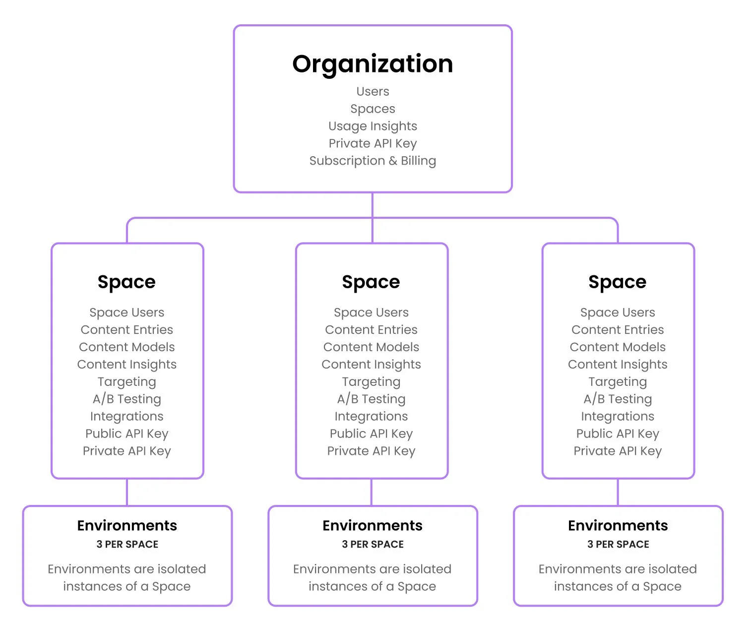
The organization is organized into different spaces. Think of a space like a separate container for your content, say for different websites or sub-brands within B2B or B2C markets. Within each space, you'll work across different environments – like Development, Staging, and Production.
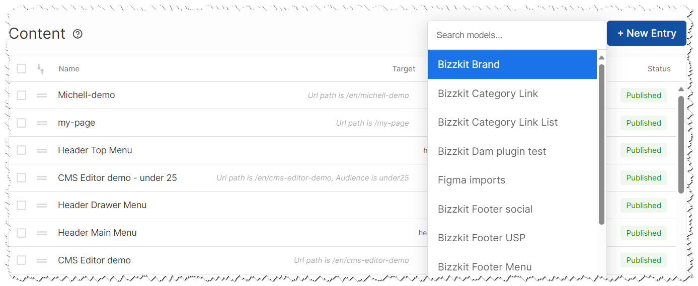
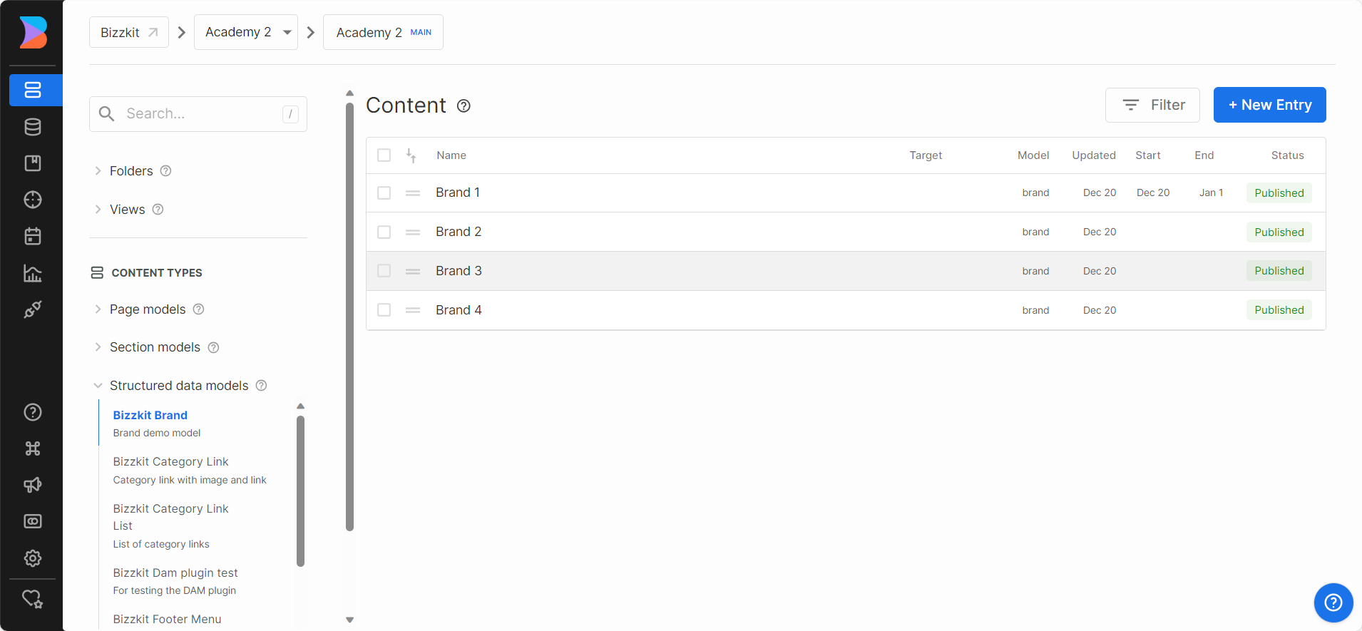
Models
In the world of content creation with Bizzkit CMS, models play a crucial role. Think of models as data templates or blueprints - they provide a structured way to create and organize different types of content on your website. The CMS offers three primary types of models to cater to various content needs:
-
Page Model: A Page model is like the foundation of a house. It's the base upon which entire pages are built within Builder. When you create a page using this model, you're essentially constructing a full webpage from the ground up.
-
Section Model: The Section model is more like a single room in that house or a paragraph in a chapter. It's used to create specific reusable parts of a page. For instance, you might have a section for hero banner, product listing page (PLP), or product detail page (PDP). Each section is a distinct part of the page, but when combined, they make the page whole.
-
Structured Data Model: Data models are quite different. They're more like the individual bricks or sentences that make up the rooms or paragraphs. A Data model structures a collection of data—like product information, customer reviews, or blog posts. This data can be displayed in various ways across your site, depending on how you choose to render it.
Think of using models in Bizzkit CMS like using a rubber stamp. Each time you stamp, the basic shape is the same, but the way you use it can vary. Similarly, once you define what a Page, Section, or Data model is, you can use these models repeatedly to build your site and fill it with content.
Models are based on (data) fields. They allow you to add and define unique data points on various models. Whether you're working with Page, Section, or Data models, fields enable you to enrich these models with data.
Info
The actual data, such as menu items, unique selling points (USPs), product categories, etc., can be stored within the builder. However, it is also possible to source this data from the solution's API layer. Subsequently, this data can be utilized in content creation through data binding.
For example, you might add a custom field for a 'Product ID' on a Product model, a 'Publish Date' on a Blog Post model or a list of Search products to a PLP. Fields comes in several data types - like text, url, number, boolean (true/false), date, lists of data, etc, and Bizzkit provides custom types like DAM reference, Search product reference(s), etc.
If you create a new entry based on a Page- og Section model you will be able to add content. If you create a new entry based on a Structured Data Model you are adding data to use for data binding.
As a content provider, you will probably not create models yourself. However, when creating a page or section, it is essential to base these on an existing model. This ensures consistency and adherence to the predefined structure of your website's content.
Adding Content
Once you have set up the application and defined your models, the next step is to start populating your site with content, such as pages or sections.
Sections
It's important to understand that a section functions as a template for visual design, intended for reuse in various parts of your site — such as Product Detail Pages (PDPs), Product Listing Pages (PLPs), announcement bars, etc. However, keep in mind that sections, by themselves, are not directly available for drag-and-drop within a page.
To make a section available for use in the CMS, it first needs to be registered as a component in the website's source code. After this integration, it becomes a usable component within the CMS for visual design purposes. This means that while sections are not typically created by content creators or end-users, once integrated, they offer valuable tools for enhancing the visual appeal and consistency of your website's design.
When you open the editor, you'll notice the surrounding page template, which reflects the live website's layout, including elements like the header and footer. These elements are usually managed within the source code of the website. In the editor, your primary focus will be the "frame" situated between the header and footer. This is where you can add and edit your content.
This interface allows you to seamlessly integrate new content into the existing structure of your website. Whether it's adding text, images, or other elements, the editor provides an intuitive platform for bringing your content ideas to life while maintaining the overall consistency and design of your site.
Info
Builder has provided an Chrome extension that could be useful
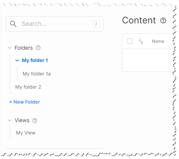
The editor simplifies content organization through the use of customizable folders and the ability to save filters as views.
Additionally, the editor offers the capability to save checkpoints of content, allowing users to revert to a specific checkpoint or a previous publication point in time.
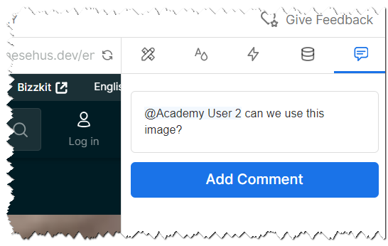
The ability to comment on and tag design and content is crucial in a team setting, and the editor facilitates these collaborative features, enabling both commenting and tagging of content.
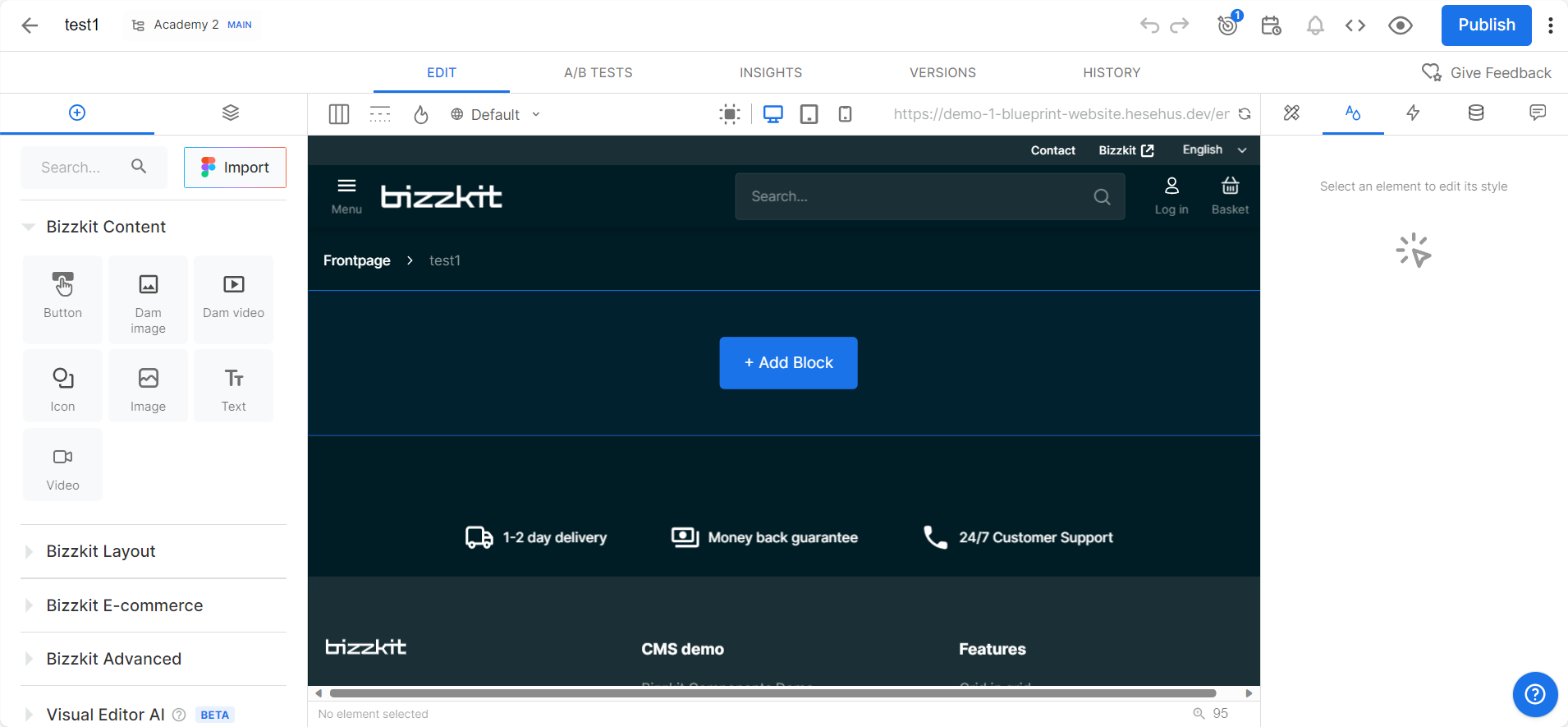
Controls
In Bizzkit CMS, when designing a webpage, the tools you need are located in the left window of the editor. This section is your creative toolbox, filled with various Bizzkit components. These components fall into several categories, each serving a specific purpose in page design:
Content Components
- Button: Create clickable links for navigation or actions.
- Icon: Add visual flair with a range of icons.
- DAM Image: Insert and customize images from the Digital Asset Management system.
- Text: A rich text editor for adding and formatting written content.
- DAM Video: Embed videos with adjustable settings like aspect ratio and playback controls.
Layout Components
- Accordion: Design collapsible content sections for better organization.
- Box: Group components in different layouts like rows or stacks.
- Carousel: Create engaging, sliding content displays.
- Columns: Arrange content in a columnar format for clarity.
- Section: Use it to create distinct sections with a maximum width on larger screens.
- Tabs: Implement tabbed content for efficient space usage.
- Vertical Spacer: Add vertical spacing between elements for better layout control.
E-commerce Components
- Buy Button: Facilitate quick purchasing decisions and add products to the cart.
- Product Card: Display product details attractively to enhance user engagement.
- Product Slider: Showcase products in a sliding format for a dynamic presentation.
- USP (Unique Selling Point): Highlight the unique aspects of products or services.
Advanced Components
- Embed: Integrate content from external sources like YouTube or Google Maps.
- Modal: Create pop-up modal windows for additional information or interaction.
Each component is designed for straightforward use, enabling you to drag and drop items into your page layout and tailor them to your requirements. From basic text to advanced interactive elements, these controls simplify the web design process.
Style and data binding
After selecting a control and dragging it to the desired location on your page or section, you can fine-tune its properties using the property window on the right side of the editor. This property window is a key feature in Bizzkit CMS, providing a range of customization options for each component you use. Here’s what you can do with it:
-
Options: Adjust the basic settings of the component, such as text content, link URLs, image sources, and more. This allows for essential customizations to fit the component to your specific content needs.
-
Style: Modify the appearance of your component, including aspects like color, font, size, borders, and spacing. These style settings are crucial for ensuring that each element aligns with your site’s overall design aesthetic.
-
Animations: Add dynamic effects to your components. This can range from simple hover effects to more complex animations that trigger when a user interacts with the component or when it appears on the screen.
-
Data Binding: Connect your component to dynamic data sources. Data binding ensures your components display the most current and relevant information.
Read more here for detailed information about these controls.
Reusable Blocks
In Bizzkit CMS, reusable blocks play a vital role in creating efficient and consistent web pages. By reusing elements like headers, footers, and product sections, you save time and ensure uniformity across your site. There are several ways to implement reusable blocks:
Templates
Templates are suited for elements with a consistent structure but varying content. Use the same design repeatedly and update the content in individual instances. Templates don't alter the original design when edited. Common uses include:
- Blog posts
- Product descriptions
- Custom product recommendations
- Various item lists
The CMS offers a range of built-in Templates, and you can create more to fit your specific needs.
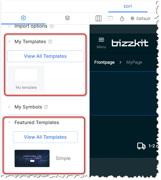
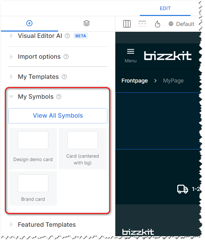
Symbols
Symbols are ideal for elements that remain constant across different pages, such as headers. When you edit the source Symbol, all instances across your site update automatically. This feature is excellent for:
- Standard forms
- Site-wide banners
- Uniform mission statements
- List of product cards
Custom Code Components
Custom code components are the ideal choice for tailor-made solutions in Bizzkit CMS. These components, crafted and upheld by your development team, are seamlessly integrated into the Builder interface. This integration empowers users who may not have technical expertise to utilize these custom elements as effortlessly as they would use standard Templates or Symbols. Notable applications of custom code components include:
- Specially designed elements that cater to unique requirements of your website.
- Integration and use of pre-existing components from your organization's codebase.
These custom components offer a level of customization and flexibility that enhances the unique identity and functionality of your website, aligning closely with your specific business needs and branding.
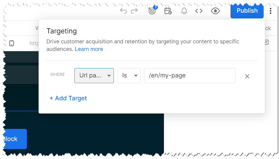
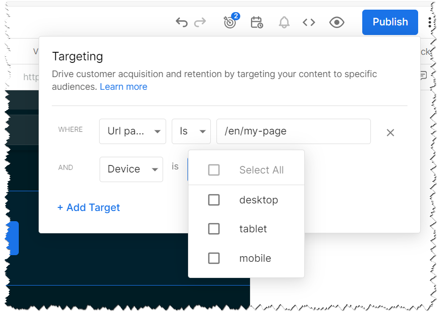
Targeting
Targeting forms a core aspect of developing an effective e-commerce solution. In Bizzkit CMS, you have the flexibility to set up targeting based on several key factors:
- URL (Routing): Determines how content is served based on the URL a user accesses.
- Device (Responsive Design): Ensures optimal display and functionality across various devices.
Additionally, Bizzkit CMS offers the capability to establish custom targeting parameters to further refine how content is presented to different user segments.
Developer's Perspective on Targeting
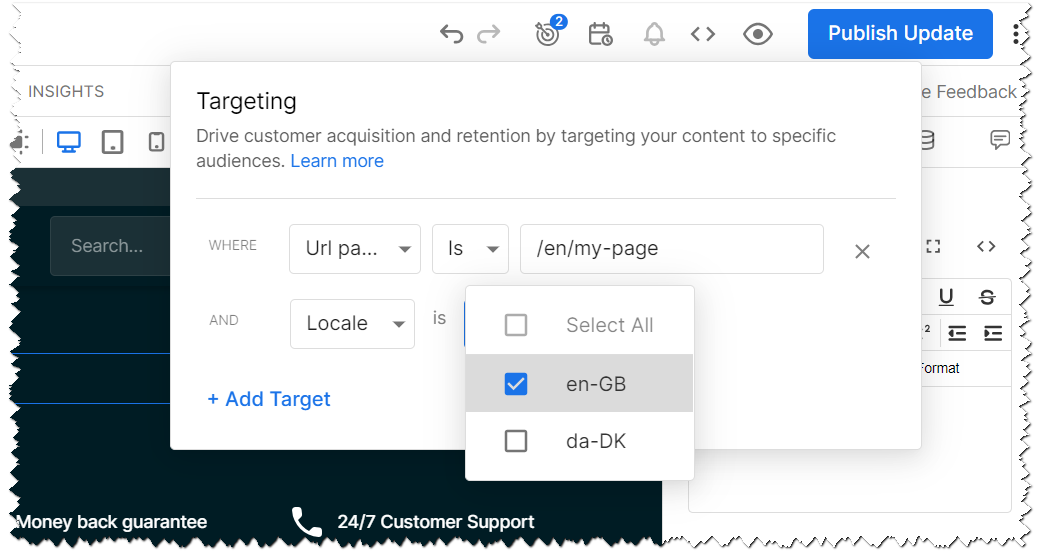
Targeting is a pivotal concept in this CMS, crucial for conditionally rendering content. It's integral in determining which specific content item to render when a model has multiple items. Targeting data refines the request, guiding Builder to find the first content item in the model that satisfies all targeting conditions. If matched, the content renders; otherwise, nothing is displayed.
A primary example of targeting is using URL paths. Setting a URL path as a targeting condition tells Builder to render a specific page for a particular path, like /about-us. Technically, this creates a targeting condition, which can be viewed as an if-then statement: if the URL path matches, then render the specified content.
You can add multiple targeting conditions to a content item. For instance, adding a device targeting condition to render content exclusively for mobile requests. However, for content to render, all conditions must be met, not just one. This is why a page might not display on a desktop if its conditions are set for mobile viewing.
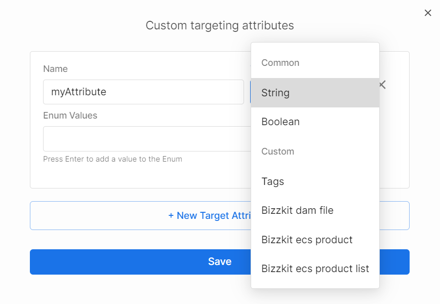
Besides URL paths and devices, which Builder infers automatically from requests, you can create custom targeting attributes. These require manual specification of targeting data. For example, with eCommerce plugins, you can target content based on user actions like adding items to a cart.
Routing
A critical element in page creation within Bizzkit CMS is routing. This feature enables the system to accurately serve the appropriate content from the CMS in response to the specific URL requested by a user in their browser. Efficient routing ensures that users are directed to the correct page, enhancing their browsing experience and streamlining their journey through your e-commerce site.
Routing in Builder is automatically inferred, meaning it's essential to set it up correctly. If the routing isn't configured accurately, the system may not find the appropriate content, resulting in a 404 (not found) error when a user requests a specific page.
Device Targeting
Similar to URL path targeting, the device type is automatically inferred and can be utilized as a targeting condition in Builder. The possible values for device targeting include:
- Desktop
- Tablet
- Mobile
You also have the option to combine these values for more specific targeting.
It's important to remember that for content to render, all targeting conditions must be met — this functions as an 'AND' operator. Therefore, if a URL matches but the device type does not align with the specified condition, the CMS will return a 404 (not found) error.
Custom Targeting Options
Custom targeting presents another versatile approach for tailoring content (such as pages, sections, and components) to specific user segments or conditions. This feature allows you to establish unique targeting criteria based on your specific needs. For example, you could use text-based attributes like "Over25" for targeting customers over 25 years old, seasonal attributes (summer, winter, spring, fall), or boolean (true/false) attributes like "VIP" for targeting VIP customers. Bizzkit enhances this capability with custom targeting attributes, including DAM tags, DAM files, Search products and lists of products.
Custom attributes enable the CMS to deliver content tailored to precise conditions. Here are a few scenarios where custom targeting can be particularly effective:
- Rendering exclusive content for VIP customers, but only if they are logged in and recognized as VIPs.
- Displaying unique content specifically tailored for customers located in certain geographical regions.
- Adapting the page's design to a younger look if the customer is identified as being under 25 years old.
- Displaying season-specific content; for example, winter-themed content during the winter season.
- Showcasing announcements or special offers relevant to the specific products a user is viewing or a list of products they are interested in.
The ability to create any custom attribute makes this a highly efficient method for rendering content based on diverse criteria.
It's crucial to note that custom attributes require implementation within the solution, ensuring that requests include the necessary values for the CMS to accurately select and return the appropriate data.
Localization
Localization is the process of adapting content and format to suit various regional preferences. This technique is crucial for presenting your site's content in the language and style preferred by different visitors. By employing localization, you can thoughtfully craft the experience for diverse target audiences, ensuring your content resonates with them.
There are various degrees of localization, allowing you to tailor your content as needed:
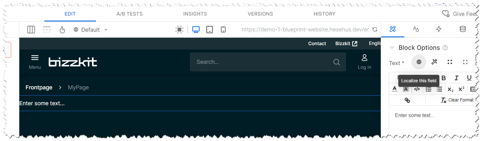
- Block-Level Localization: Modify individual blocks of text, images, colors, etc. within the Visual Editor to cater to different languages or regional dialects.
- Page-Level Localization: This extends beyond text to encompass entire pages, giving you the flexibility to alter not just the copy, but also images, and potentially the layout, for different regions.
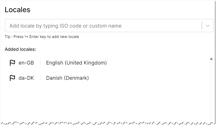
You can create as many locales as needed, and once established, these locales can be effectively utilized in both Text- and Page-level localization strategies. Additionally, they serve as valuable targeting attributes, allowing you to fine-tune content delivery based on the specific locale of your audience.
To localize an entire page, the process involves creating a duplicate of the page and then applying a locale-specific targeting attribute.
This method allows for comprehensive customization of the page's content, ensuring it aligns precisely with the cultural and linguistic preferences of the targeted locale.
Note
It's important to recognize that effective localization requires integration within your solution, as the CMS needs to discern the specific locale from each request. This locale information can be harvested from various sources within your system, such as the URL, cookies, or backend processes. Proper integration ensures that the CMS accurately identifies and responds to the locale preferences of each user, enabling a tailored content experience.
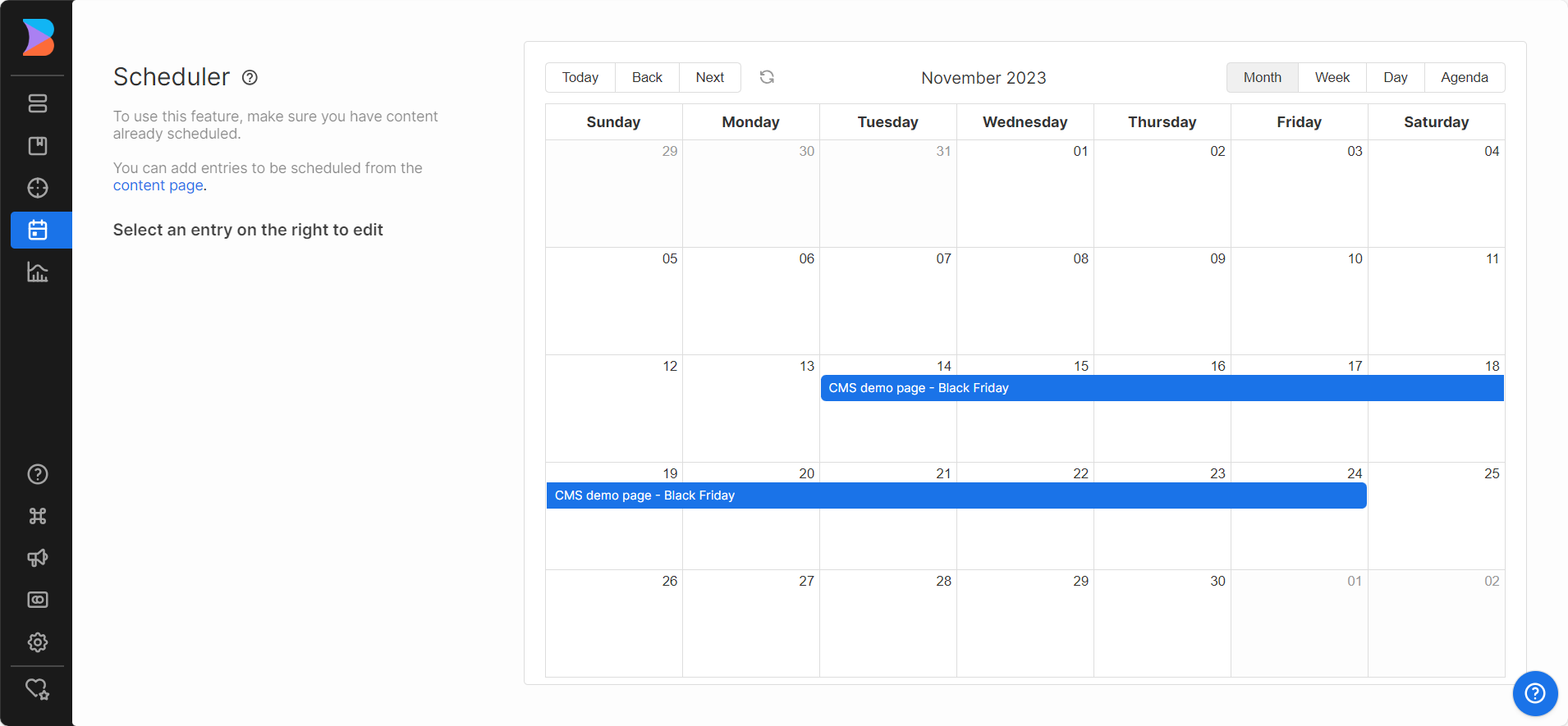
Scheduling
In the CMS, scheduling is a feature designed to optimize content delivery timing. It's not just about when content appears on your site or app, but about aligning this content with strategic objectives, such as marketing campaigns or special events. This feature is essential for ensuring that your audience sees the most relevant content at the most appropriate time.
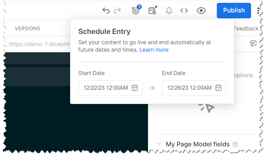
Scheduling involves setting specific dates and times for content to go live. This capability is particularly useful for launching new promotions, updating seasonal content, or ensuring that time-sensitive information is displayed exactly when needed. It helps in maintaining a fresh and current feel to your website or app, keeping your audience engaged with the latest updates.
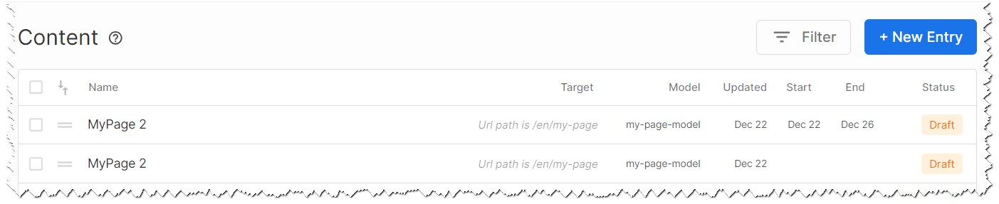
In the CMS, you have the flexibility to schedule various types of content, from entire pages to individual sections. This allows for a granular approach to content management, where each piece can be tailored to specific audience segments or business goals.
One of the key aspects of effective scheduling is having a fallback plan. This means having content ready to take over once a scheduled piece reaches its end date. This approach ensures a seamless transition and continuous content availability, preventing gaps that might impact user experience.
Scheduling is not just a matter of convenience; it's a strategic tool. It allows for better planning and coordination of content-related activities, ensuring that each piece of content serves a specific purpose and contributes to the overall objectives of your site or app. By leveraging scheduling, you can create a dynamic, responsive content strategy that adapts to the evolving needs of your audience and your business.
A/B Testing
A/B testing is a fundamental tool for improving your website or app through a data-driven approach. It allows you to test different content and experiences, helping you make informed decisions to enhance your site's effectiveness.
To engage in A/B testing, the content you wish to test must be created and managed within the CMS itself, and offers several advantages for A/B testing:
- Seamless conversion tracking within a user-friendly interface.
- The ability to conduct numerous comparisons, tailored to specific needs.
- SEO-friendly testing that does not compromise your optimization efforts.
- An uninterrupted user experience, free from unwanted content flashes or UI blocking.
- Straightforward operation that requires no coding, making it accessible to all users.
- Efficient compression techniques like gzip, minimizing performance impact even with multiple test groups.
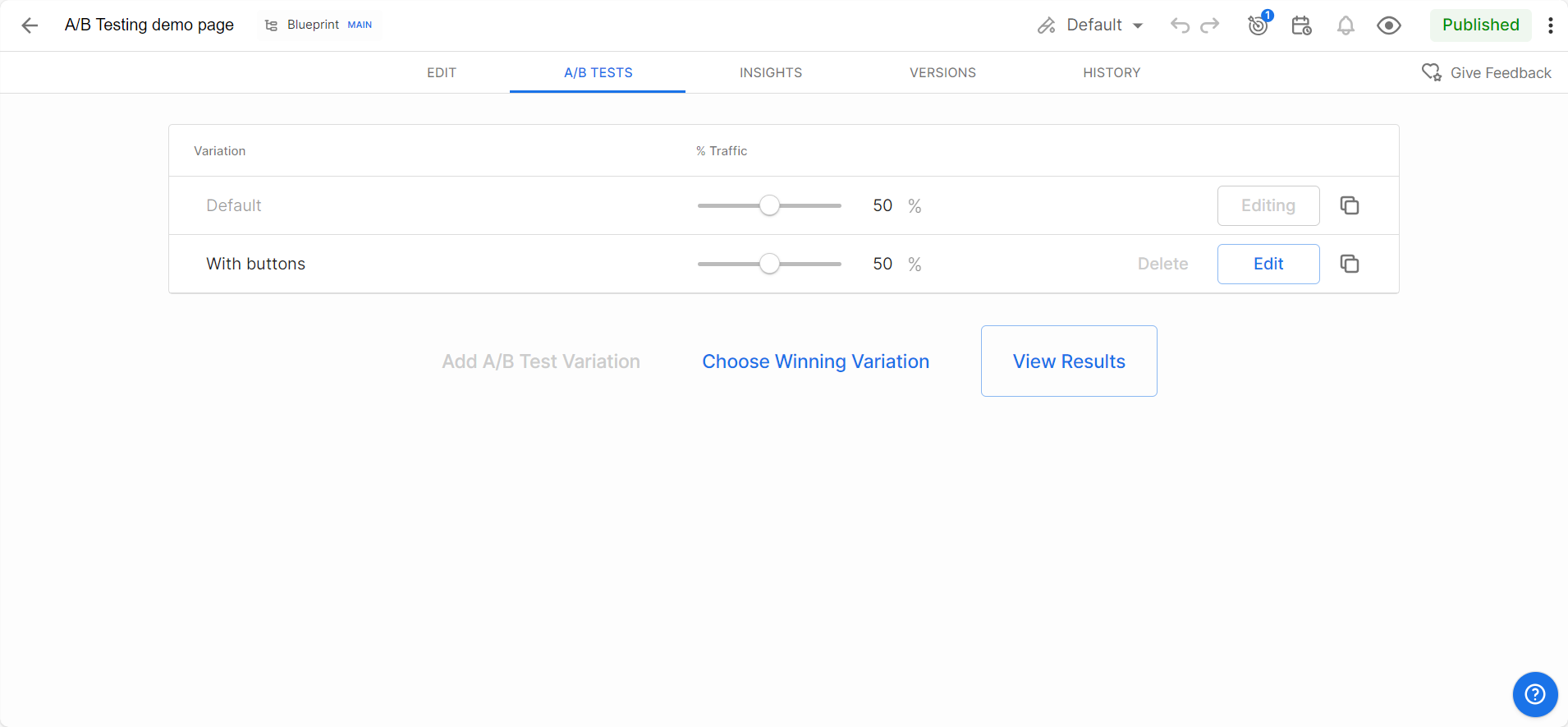
To begin A/B testing, you create distinct variations of a page or piece of content. This process involves adding new variations in the A/B Tests tab, naming them, and fine-tuning their test ratios. You can make adjustments to each variation and publish them to initiate the test.
A/B testing can extend to content like headers, copy and designs, colors, CTA (call to actions) positions, and hero images. It's also useful for experimenting with form formats and responsiveness to device types.
Utilizing Environments
Environments in the CMS are dedicated workspaces designed for testing, experimenting, and making changes to your digital assets. This setup ensures that alterations don't affect your live production environment until they are fully ready for implementation.
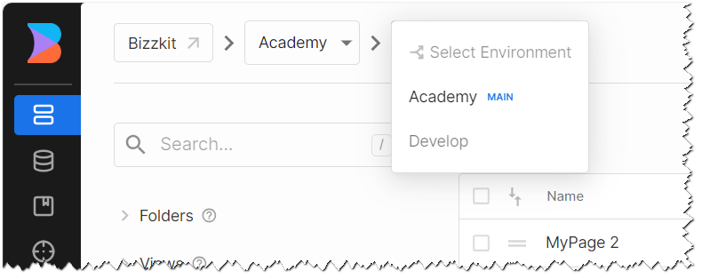
With environments like Development, QA, and Production, you can work through different stages of your project lifecycle with ease. Each environment acts as a distinct phase, allowing seamless progression of your work. Some of the key features includes:
- Isolated Testing: Make and test changes in a safe, segregated space.
- Code and Model Updates: Experiment with code changes or model schema modifications without impacting your live site.
- Controlled Implementation: Push changes to your live environment only when you're confident they're ready, ensuring quality and precision.
By default, Live Sync keeps your environments synchronized in real-time. However, you have the option to turn off Live Sync for specific models or content, allowing for independent modifications.
Live Sync
Live Sync is a feature designed to streamline the development and content management process. It functions by automatically synchronizing content and model changes across different environments. The primary purpose of Live Sync is to ensure consistency and facilitate efficient workflow management.
When Live Sync is active, any modifications made in the main environment are instantly reflected across all connected environments. This feature is particularly beneficial for maintaining uniformity in content and models, especially when working with multiple teams or on large-scale projects.
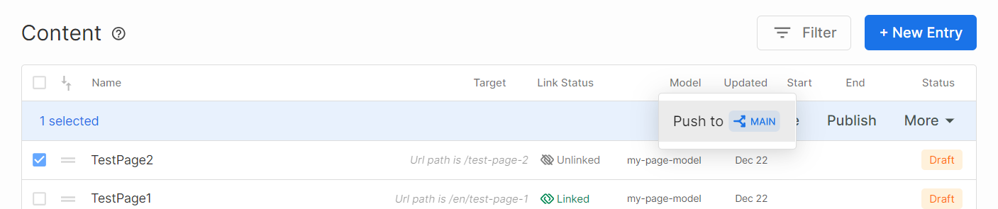
The automatic push from the main environment to others ensures that all team members are working with the latest updates, reducing the likelihood of conflicts or outdated information being used. It’s a crucial tool for teams that need to keep their development and staging environments up to date with the production environment, providing a reliable and efficient method for testing and quality assurance.
However, Live Sync also offers flexibility. You can choose to disable it for specific models or content entries, allowing for independent development and testing without affecting the live environment. This makes it an adaptable tool, fitting various project needs and workflows. Live Sync strikes a balance between automated efficiency and controlled, manual input, making it an essential feature in modern CMS platforms.