Bizzkit Components
Bizzkit components are used for creating CMS content on the website. The groups and components described below are an integrated part of the Bizzkit CMS.
Content
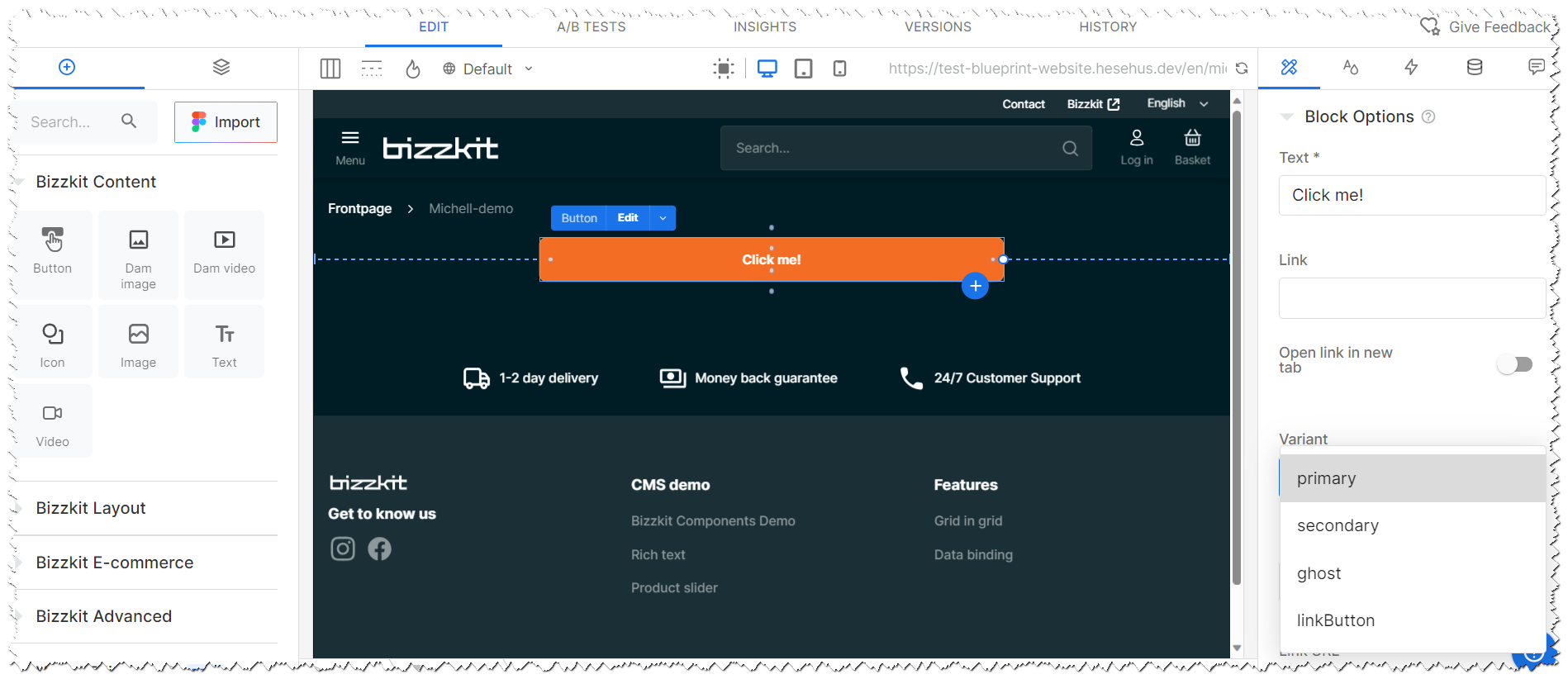
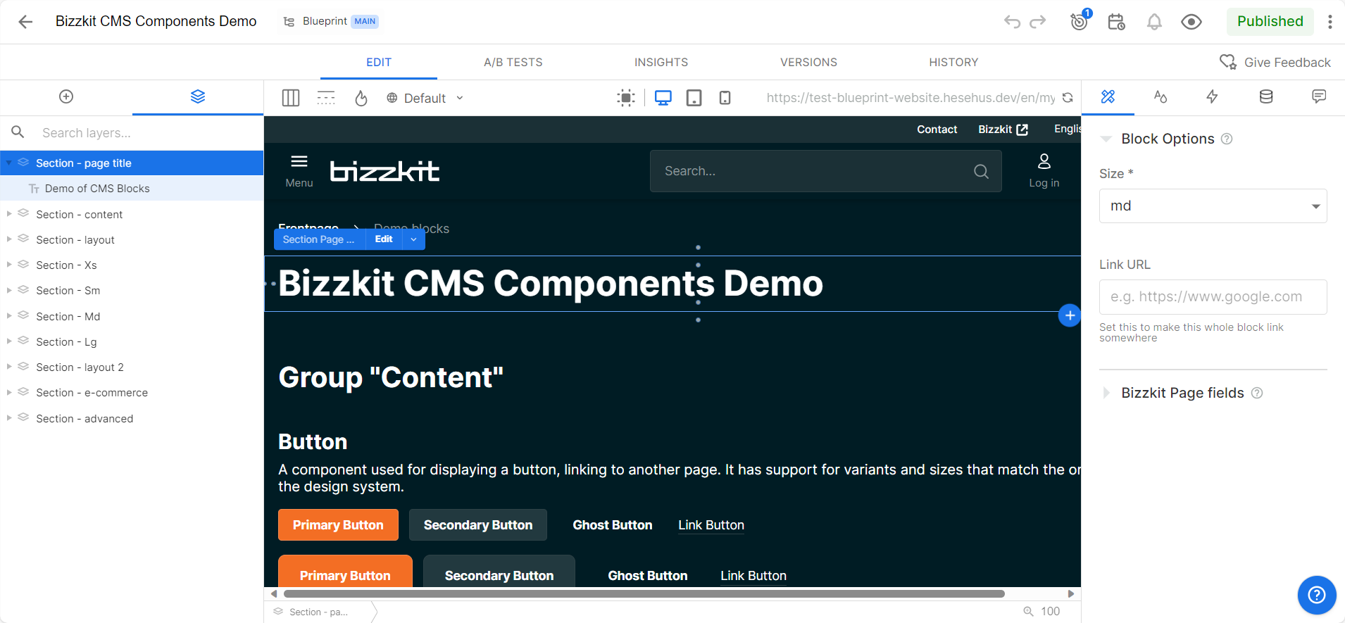
Button
A component used for displaying a button, linking to another page.
Icon
A component used for displaying an icon with sizes and icons available in the design system.
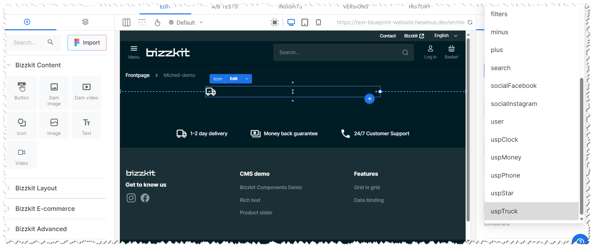
DAM Image
A component used for displaying an image from the Bizzkit DAM with options to control the image aspect ratio etc. The image can also be used as background behind other CMS content, that are nested inside the DAM Image component.
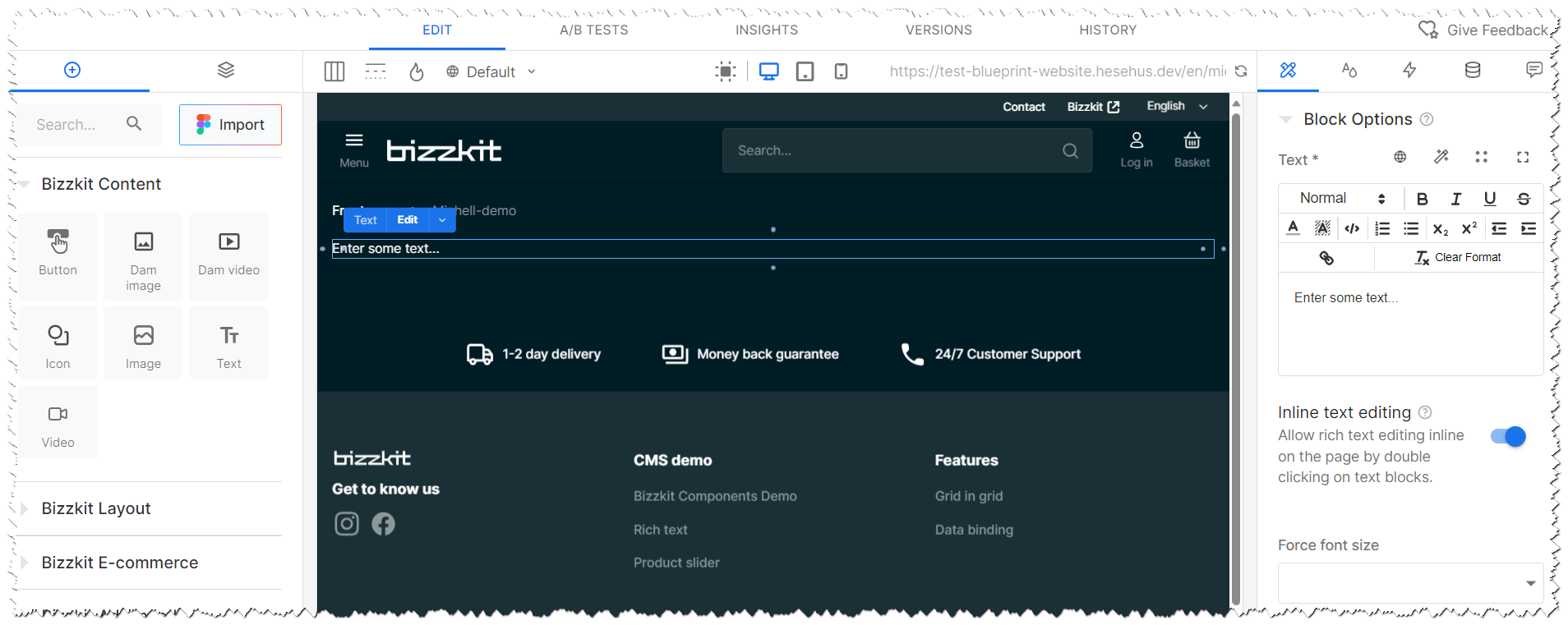
Text
A component used for displaying text via a rich text editor.
DAM Video
A component used for displaying a video from the Bizzkit DAM with options to control the video aspect ratio, auto play, loop, mute, whether the controls should be shown etc. The video can also be used as background behind other CMS content, that are nested inside the DAM Video component.
Layout
Accordion
A component used for displaying an accordion with a list of items, where each item can be expanded to show more content. Other components can be nested inside the Accordion item.
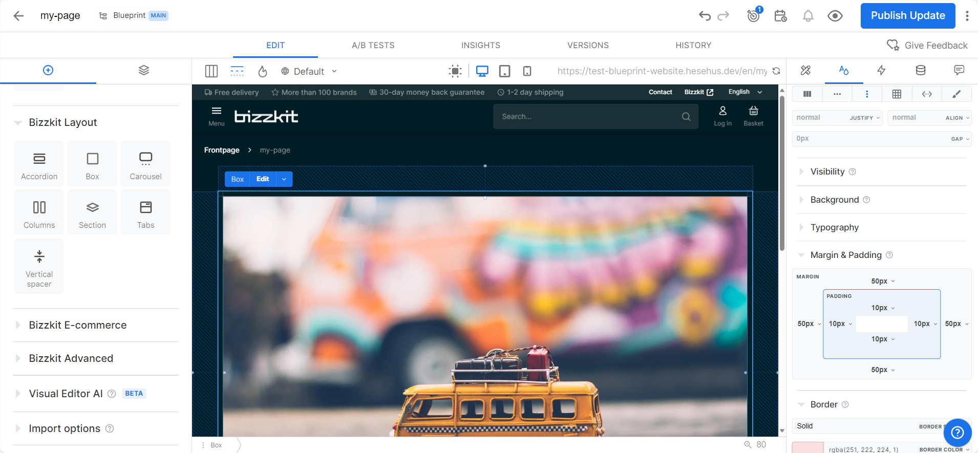
Box
A component used for displaying groups of components in a row-, stack-, wrap- or canvas-like layout.
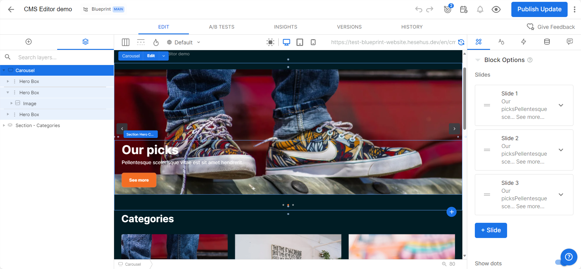
Carousel
A component used for displaying a content in a carousel. The content can be any component, but is typically used for displaying DAM Images or DAM Videos.
Columns
A component used for displaying groups of components in a column-like layout.
Section
A component used for displaying content within a container that has a max-width on larger screens and centers the content horizontally. Other components should be nested inside the Section component.
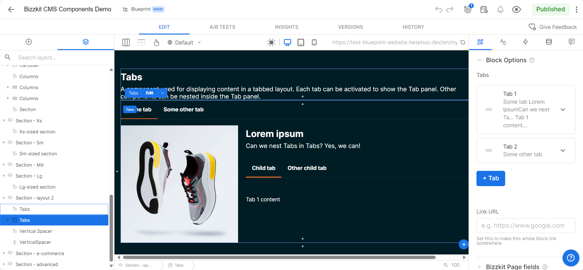
Tabs
A component used for displaying content in a tabbed layout. Each tab can be activated to show the Tab panel. Other components can be nested inside the Tab panel.
Vertical Spacer
A component used for adding vertical spacing between components.
E-commerce
Buy Button
A component used for displaying a button that opens a drawer with a product selector. The selected products are added to the cart when the user clicks the "Add to cart" button in the drawer.
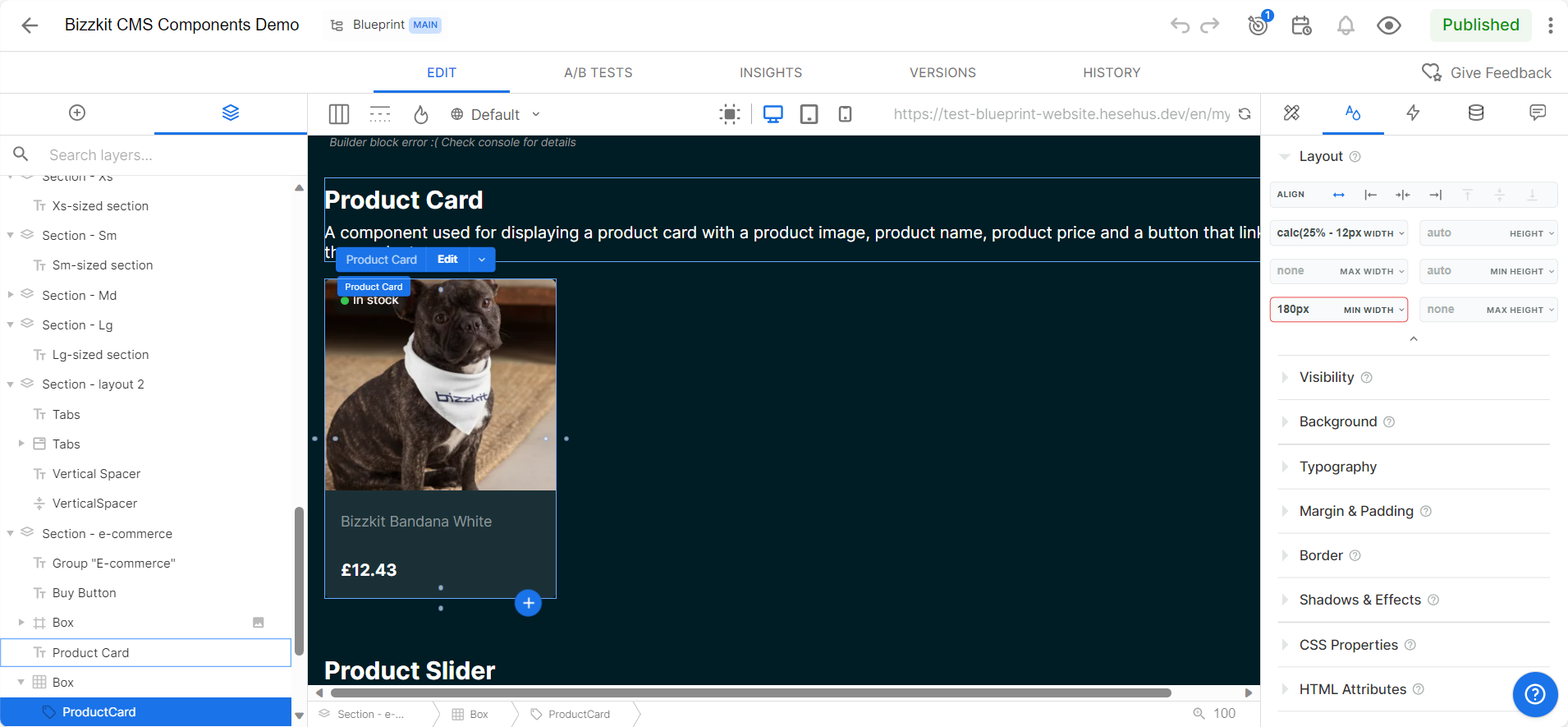
Product Card
A component used for displaying a product card with a product image, product name, product price and a button that links to the product page.
Product Slider
A component used for displaying a slider with a list of products. The products are displayed as product cards and link to the product page.
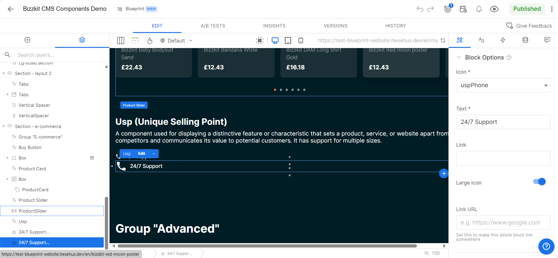
USP (Unique Selling Point)
A component used for displaying a distinctive feature or characteristic that sets a product, service, or website apart from its competitors and communicates its value to potential customers.
Advanced
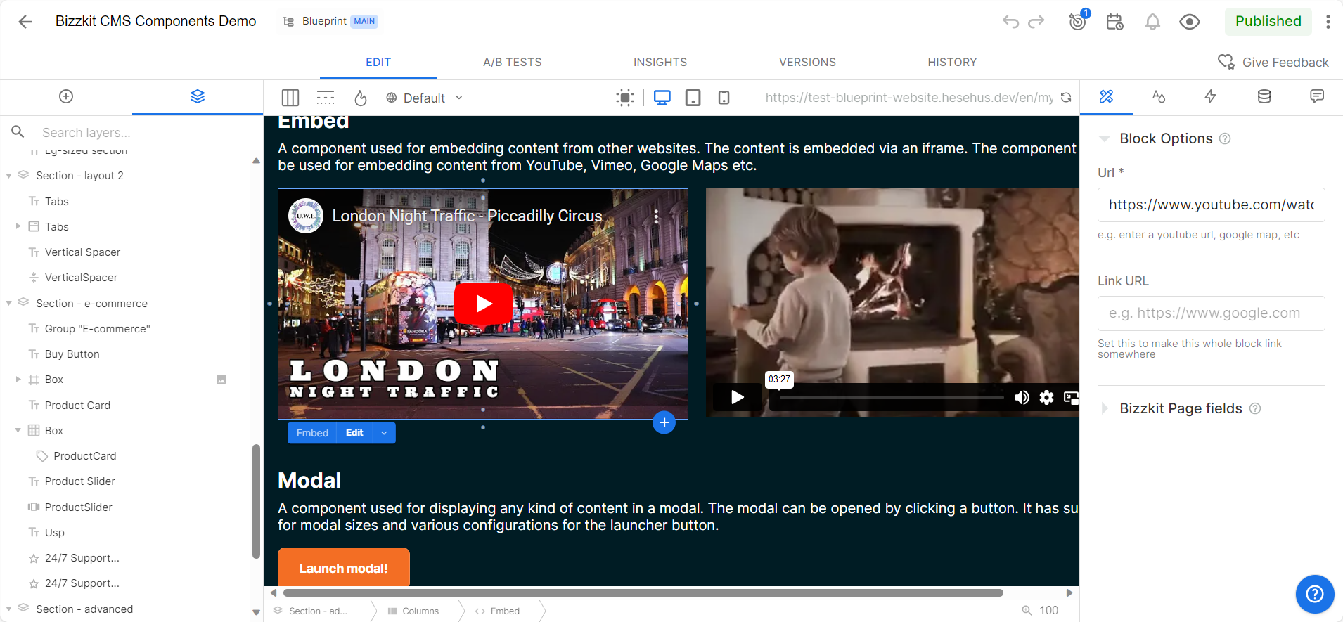
Embed
A component used for embedding content from other websites. The content is embedded via an iframe. The component can be used for embedding content from YouTube, Vimeo, Google Maps etc.
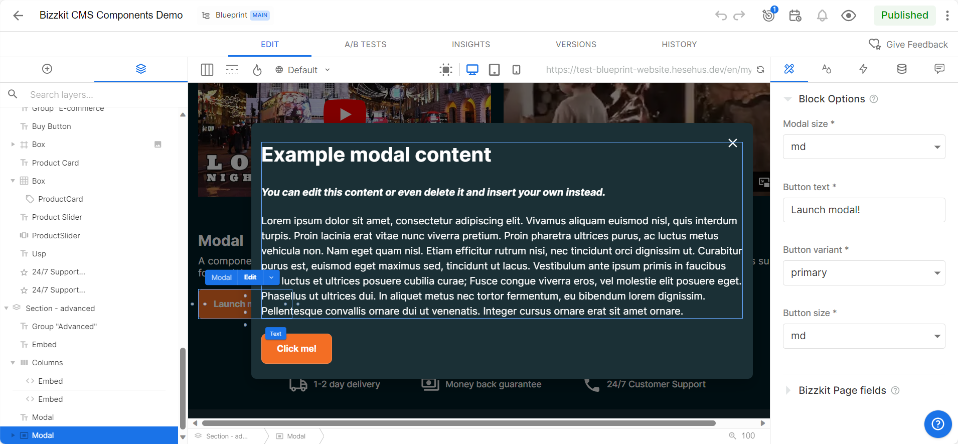
Modal
A component used for displaying any kind of content in a modal. The modal can be opened by clicking a button.
Getting started
Please see Getting Started for more information